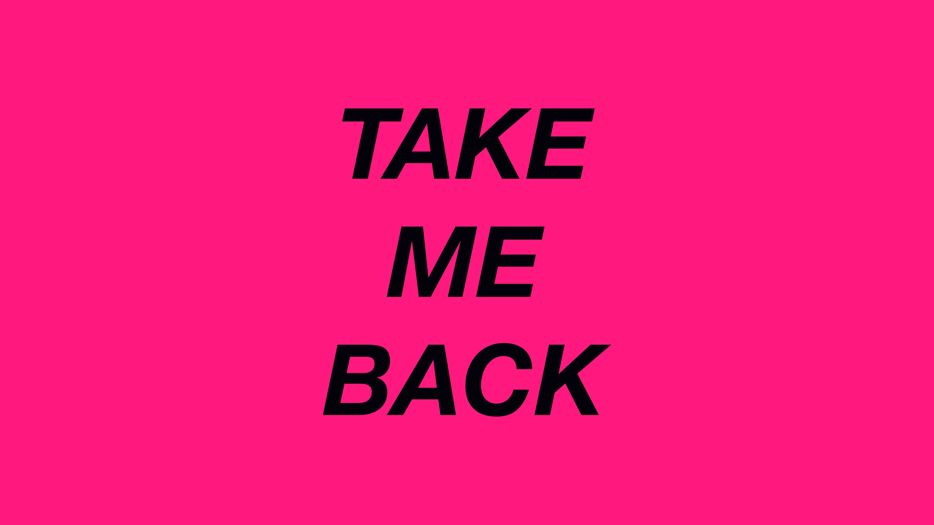
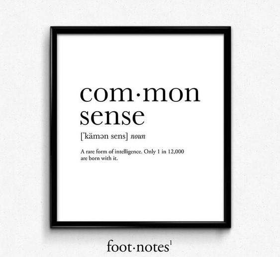
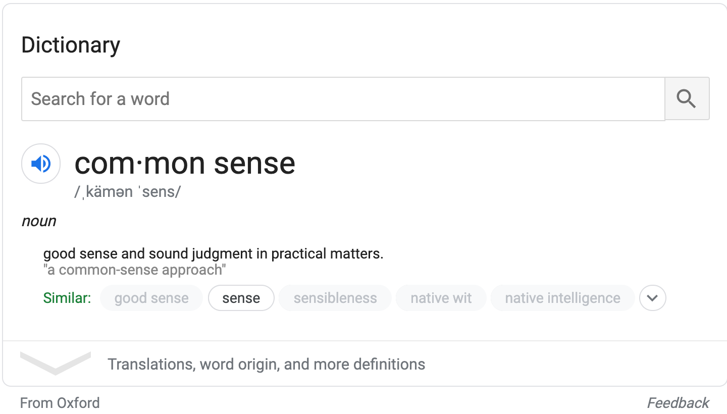
Common Sense
With the goal of encouraging others to stay home during the 2020 Covid-19 pandemic, the phrase “Common Sense” comes to mind and is used in this infographic.
(Music: Michael Karaman, Narration: Sabrina Guyton)
Original Script
It all begins with an idea. Maybe you want to launch a business. Maybe you want to turn a hobby into something more. Or maybe you have a creative project to share with the world. Whatever it is, the way you tell your story online can make all the difference.
Don’t worry about sounding professional. Sound like you. There are over 1.5 billion websites out there, but your story is what’s going to separate this one from the rest. If you read the words back and don’t hear your own voice in your head, that’s a good sign you still have more work to do.
Be clear, be confident and don’t overthink it. The beauty of your story is that it’s going to continue to evolve and your site can evolve with it. Your goal should be to make it feel right for right now. Later will take care of itself. It always does.
Final Script
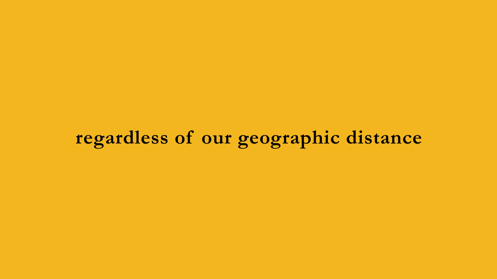
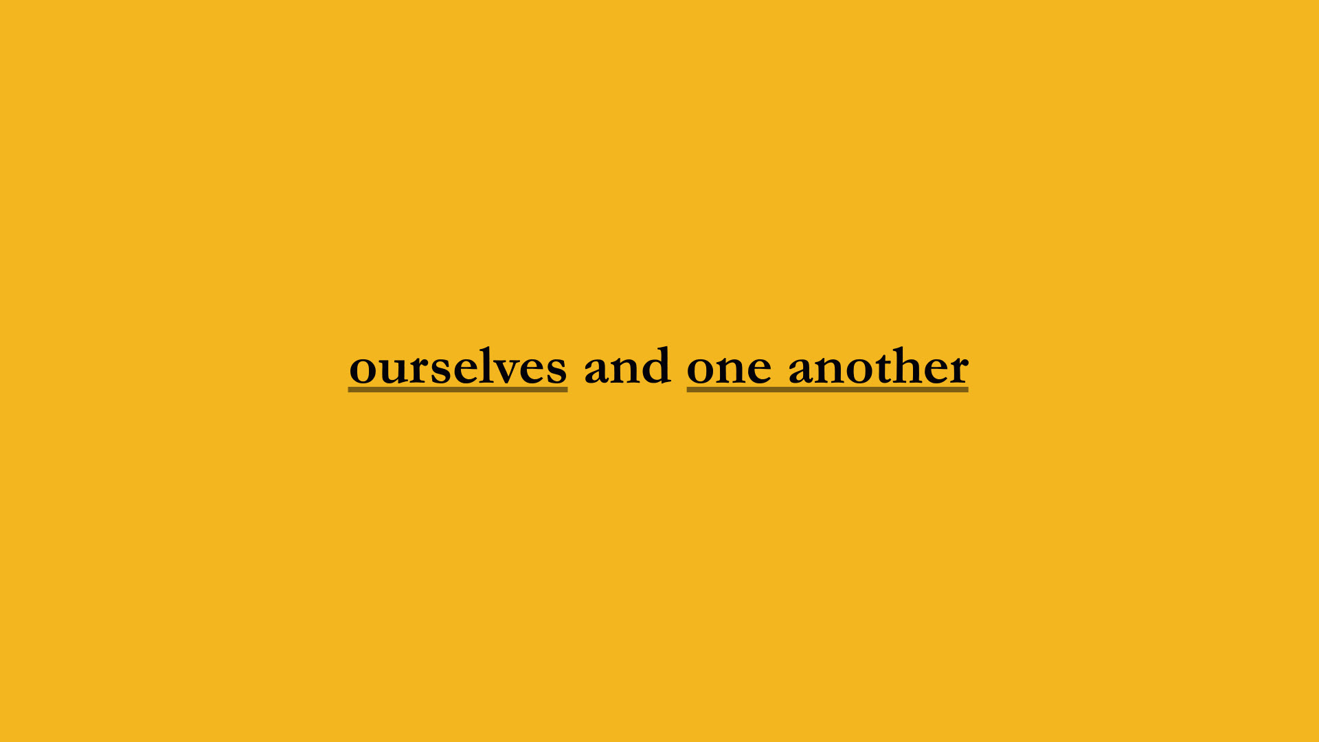
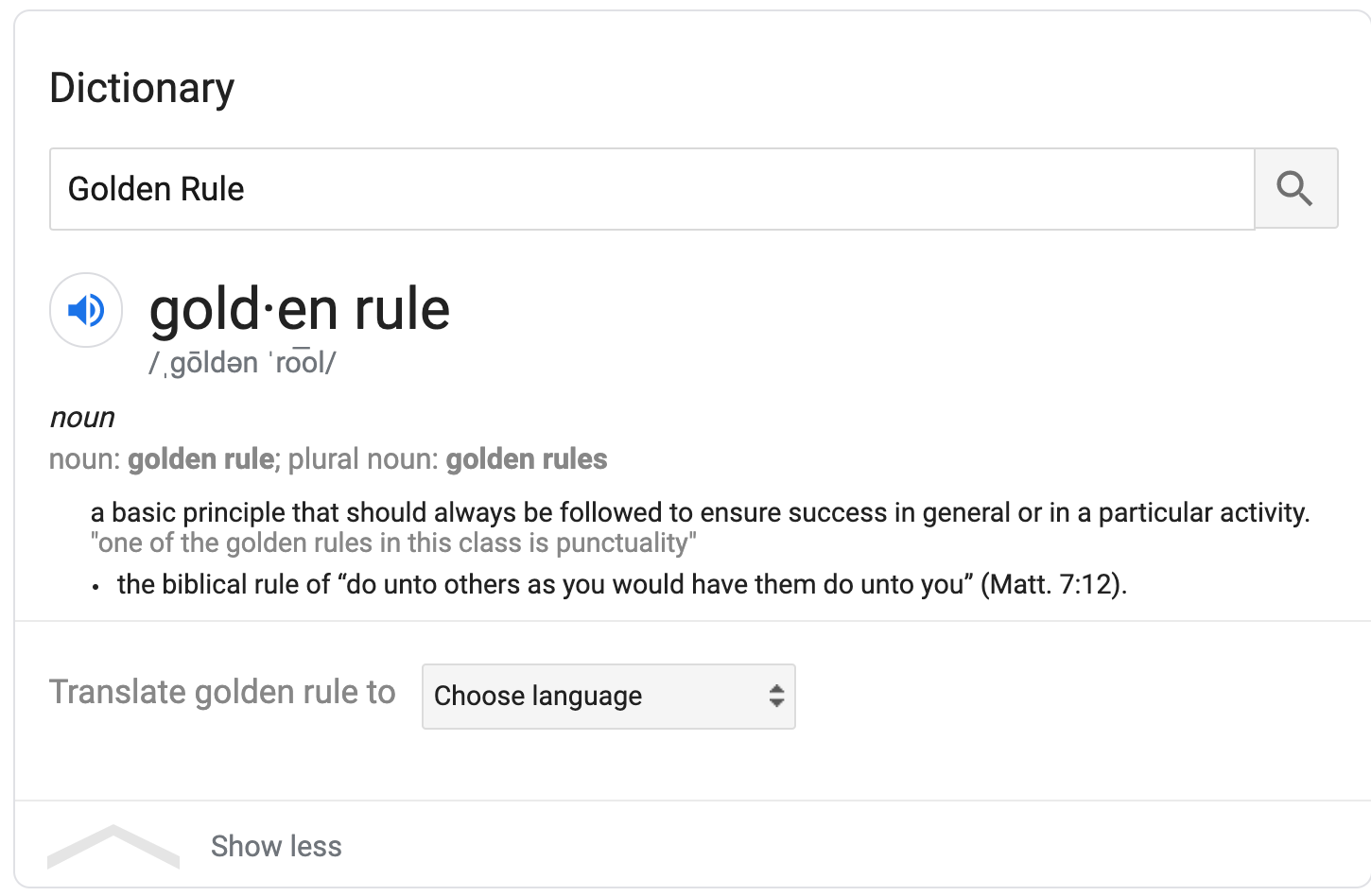
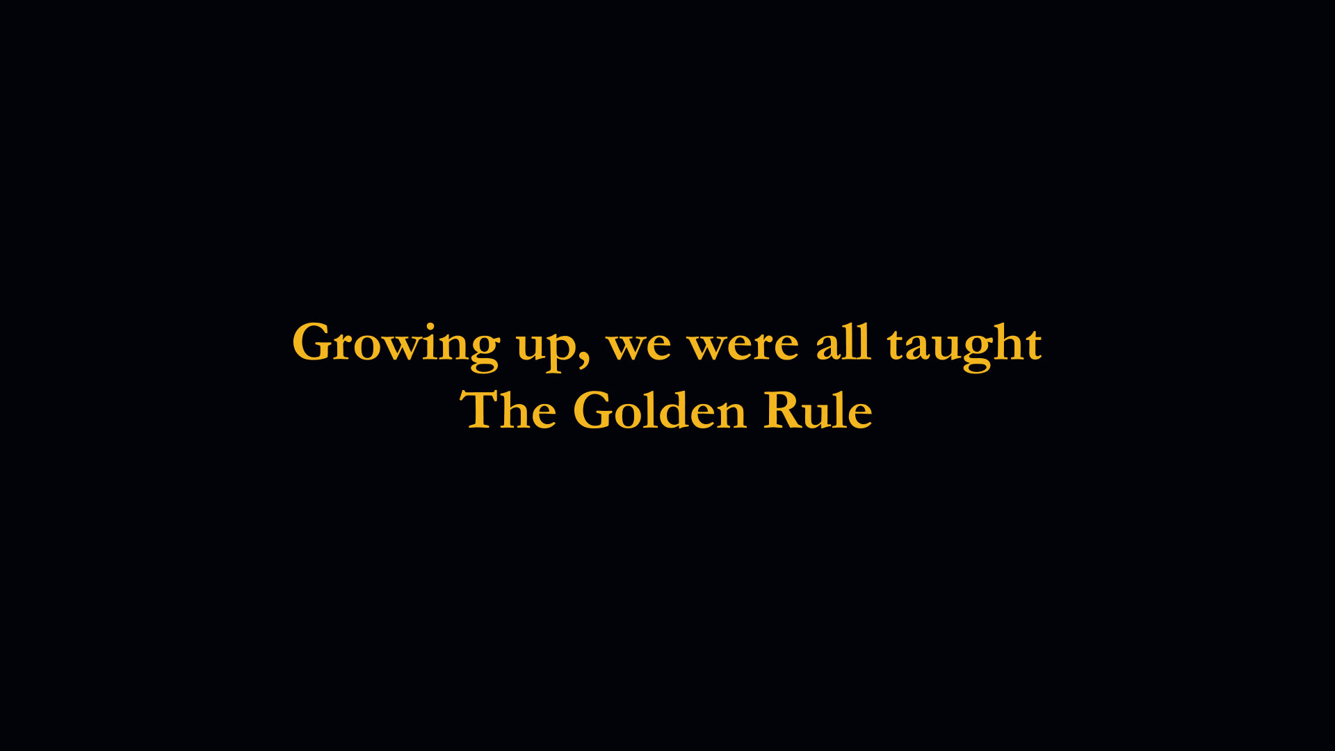
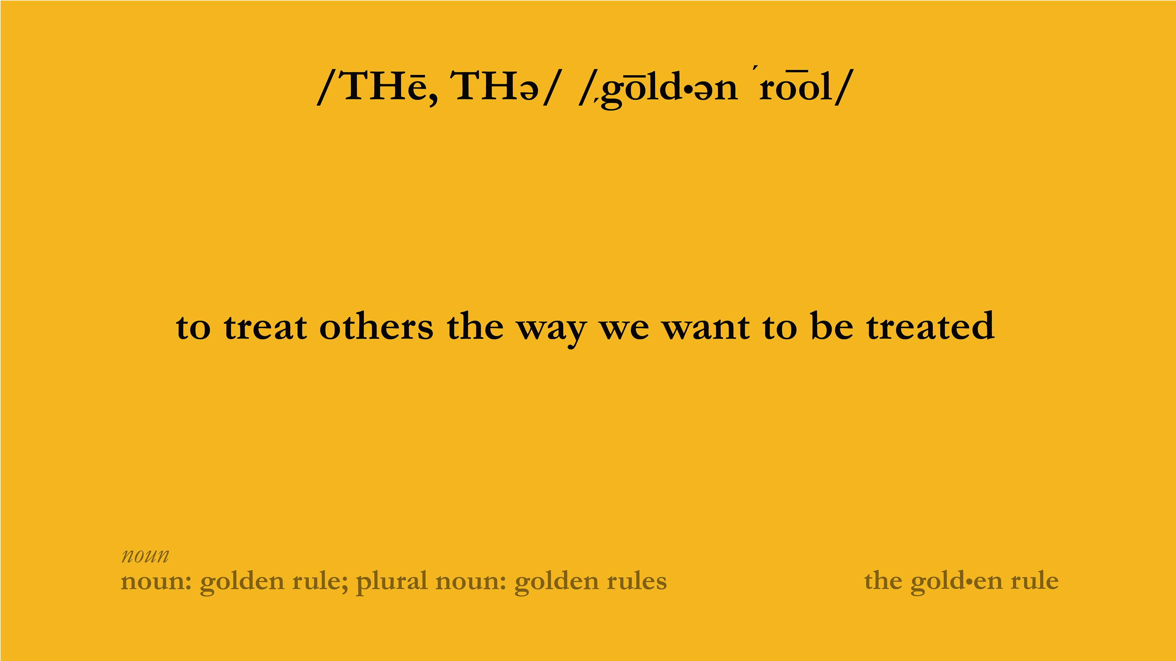
Growing up we were all taught the golden rule: to treat others the way we want to be treated. Today, in a time when nothing feels like it makes sense, we are relearning how to apply this principle within unfamiliar global circumstances. We still have the choice to love every neighbor regardless of our geographic distance. To prioritize and protect the lives of others by pressing pause on ours. Recalibrating our lifestyles at this time, shifts the narrative to one in which we not only care for ourselves but, first and foremost, choose to care for one another.
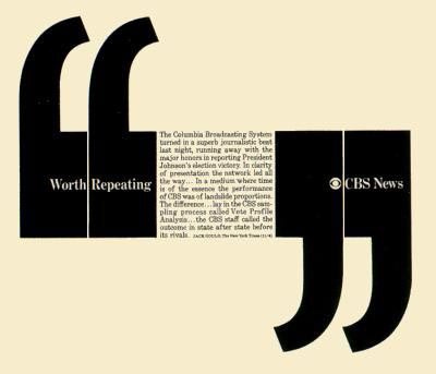
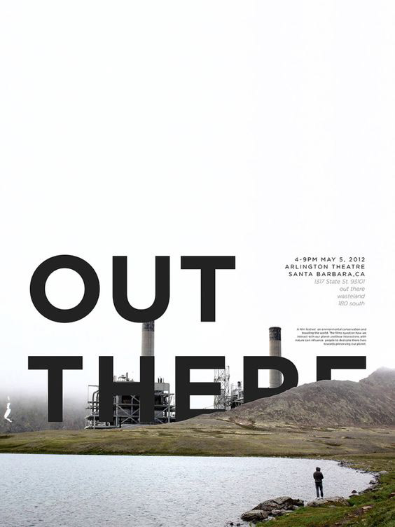
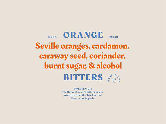
Mood Board
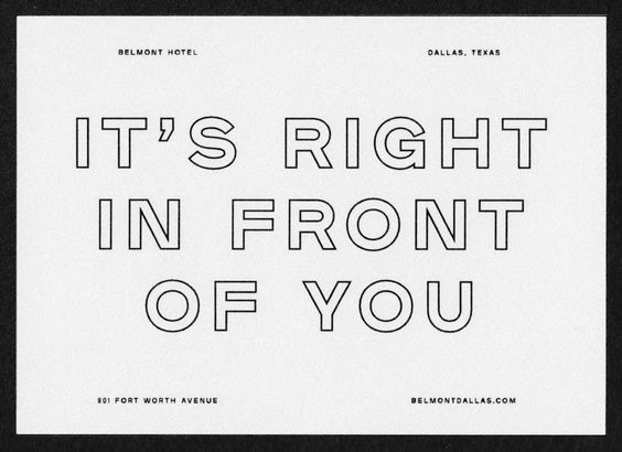
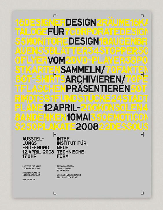
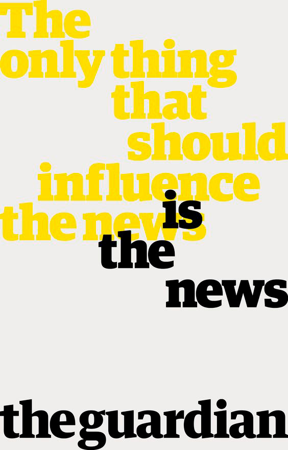
Design Board

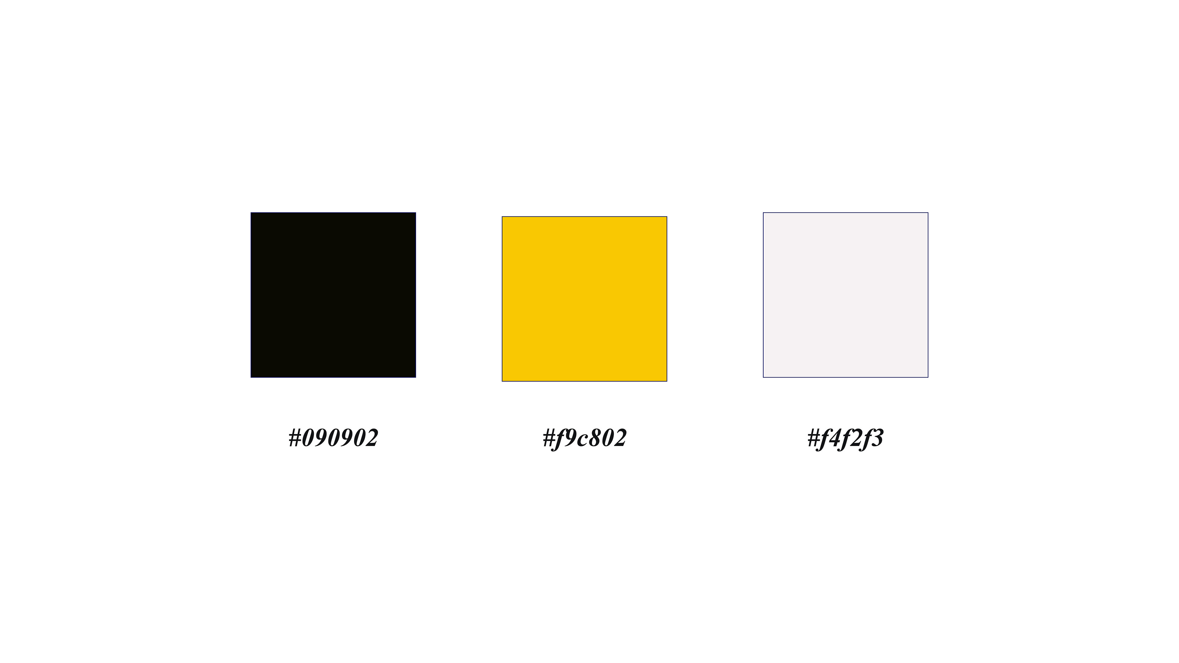
Color Palette
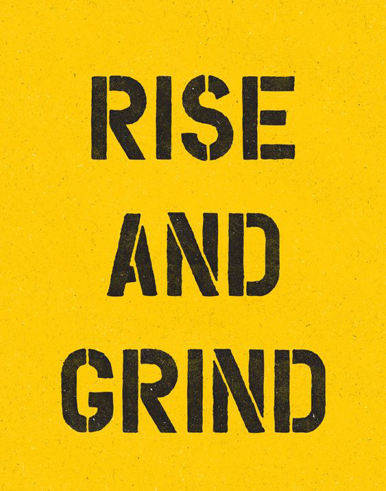
To further send home the idea of “common sense” being a clear idea, I used black and white. I also used yellow to “highlight” the clear principle of common sense. I also used yellow because it is a warm, optimistic, and cheerful color, which I thought was also important for this piece because I wanted to communicate the idea in a welcoming way.
Text Exploration
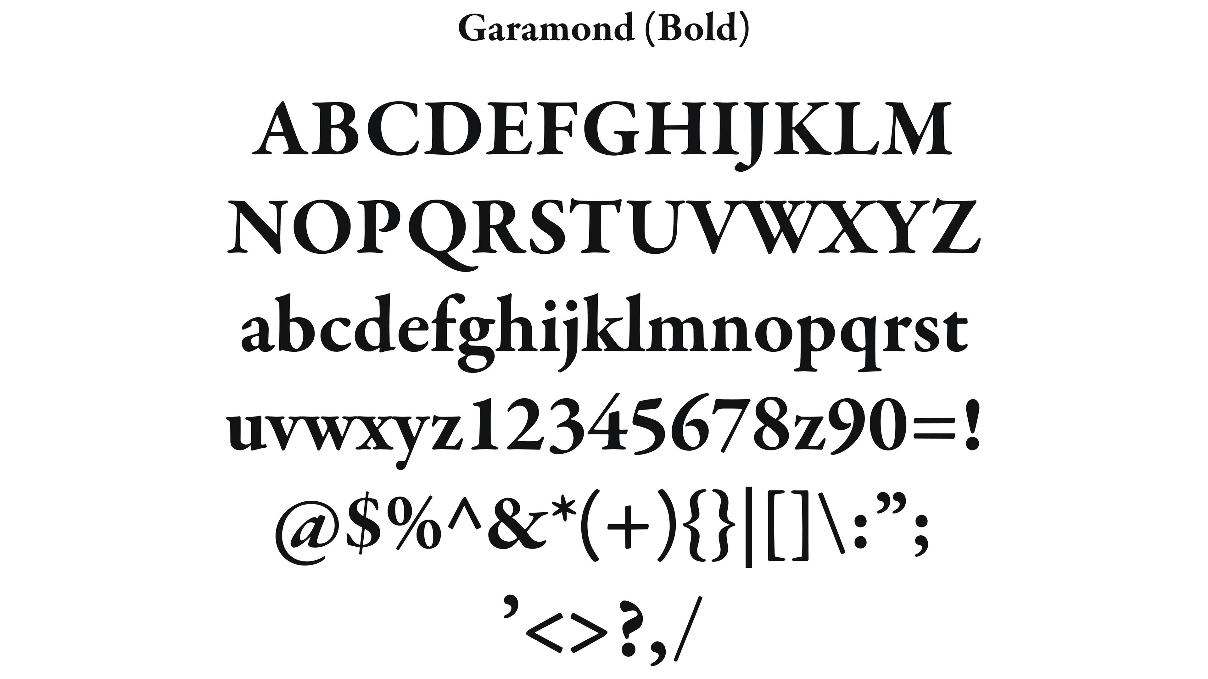
Garamond (Bold)
I wanted to use a classic font that was elegant and distinct. Garamond is a popular font used for book printing and body text, which coincides with my visual reference of Google search results. Google uses Arial for their search results page, but I thought it was important to have a serif typeface for this piece.
Preliminary Design Test
Final Frames